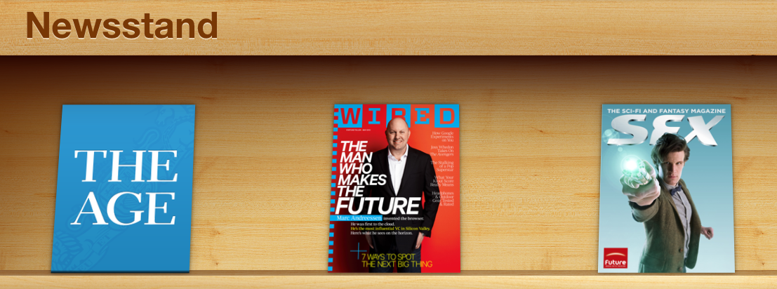
No longer blurry
Hah. Well, it’s not blurry any more. Apparently the trouble with changing an iPad app to a Newsstand app is that people can’t find it. There’s already a few 1-star “OMG the Age disappeared” reviews on the app store.
So, now we have THE AGE in big letters, hopefully only until everyone finds the damn thing. I like dynamic covers. Just not blurry ones.
UPDATE: No, it looks like it was just blue because they hadn’t released a cover subsequent to the update yet. Our long national nightmare of un-retina-friendly covers for The Age continues. More as it develops, except possibly not as I’m feeling deeply boring.


