A very quick review of The Saturday Paper (app)

[I’ve dropped some updates here until I actually bother to write a better thing about it.]
There’s a new paper by the folks who make the Monthly. In an impressive feat of dull naming, it’s called The Saturday Paper. Whatever. I’m interested in the journalism, which so far seems pretty good. [It’s been excellent: the articles are a nice balance between news and long form that gets relatively in-depth without being a slog.]
But I’m not impressed by the app. [Update: it’s less bad than it was initially.]
I haven’t even been able to log in with my account on the iPad. Tapping the “Account” button helpfully takes you to a blank screen. If you lock the iPad and open it again, it might open a login dialog… but trying to log in here is fruitless, and just means a lot of disappointing watching of an off-centre progress spinner. [A week later, this started to work… and it’s a much nicer app on the iPad.]
I did log into the iPhone app, which after my failures with the iPad felt like a bloody triumph. I popped into an article and was confronted with this.
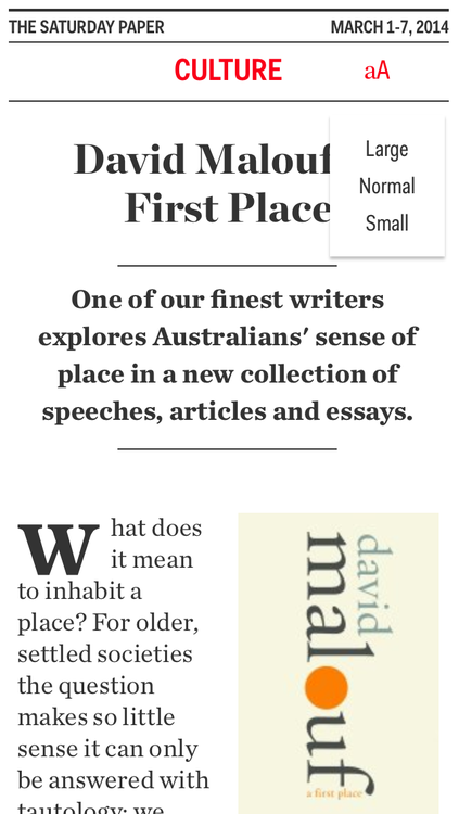
…ew. Why attempt a drop cap at all if you can’t actually line it up with the text? I then tapped on the “aA” button to see what options I had there for de-grossing. However, attempts to select from Large, Normal and Small text there will be met with failure if you tap too close to the right: the app treats this as an article-switch.
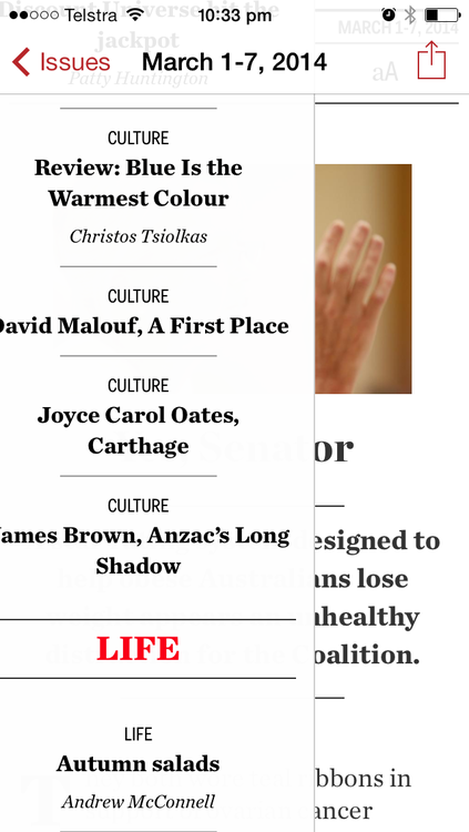
Yep, in this day and age of prevalent swipe-to-go-back, the Monthly has decided to go with the “all the articles are sitting alongside each other, left-to-right” metaphor, so that you can swipe (or tap the side margins) to move from one to another. This isn’t necessarily bad. But when you call up the issue’s ‘menu’ of contents by double tapping… it slides on from the left, thus enticing you later to try (and fail) to bring it back by right-swiping.
And if you scroll down all the way in the contents menu, you get this.
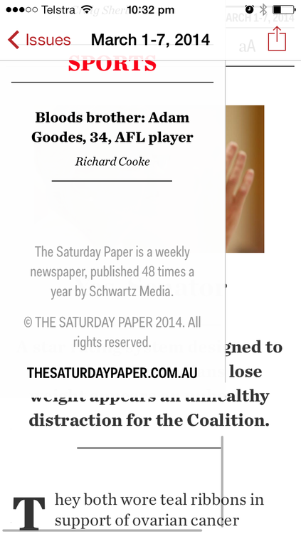
Ew, again. And for a third round of ew, you’ll notice that there’s a horizontal scrollbar at the bottom. Which means…
Oh god. [This stuff is still shitty. Their choice of gestures continues to irritate.]
I hope we get lots of updates to this app in the three months of my initial subscription. Mostly, I hope the iPad starts to actually be usable. And if they do manage to hit some level of competence, here’s a few other requests:
- A share menu. I hear that social media is kind of a big deal these days.
- Keep track of which articles I’ve read, and how far I am through the ones I haven’t. I’m surprised more news/magazine apps don’t try to do this. Most of the articles are of decent length here, so it’d be particularly valuable.
- Add support for sending articles to read-later services. Actually, maybe do this first so I don’t have to struggle through the teething problems in the app.
I did like one thing. Tapping the bottom or the top of the page takes you one page up or one page down. That’s pretty useful for someone like me who prefers pagination in their articles. See? I can say nice things. Sometimes.